Veil - A Frictionless Checkout Across Mobile and Web
Veil - A Frictionless Checkout Across Mobile and Web
Veil - A Frictionless Checkout Across Mobile and Web
A unified checkout experience designed to reduce abandonment and increase conversion.
A unified checkout experience designed to reduce abandonment and increase conversion.
A unified checkout experience designed to reduce abandonment and increase conversion.

Problem Statement
Problem Statement
Problem Statement
73% of mobile users abandon at checkout. Desktop performs only slightly better, with most experiences still rated mediocre or worse, revealing a systemic failure in how checkout is designed.
73% of mobile users abandon at checkout. Desktop performs only slightly better, with most experiences still rated mediocre or worse, revealing a systemic failure in how checkout is designed.
73% of mobile users abandon at checkout. Desktop performs only slightly better, with most experiences still rated mediocre or worse, revealing a systemic failure in how checkout is designed.
Design Principles
Design Principles
Design Principles
Guest-first, always.
Account creation is a post-purchase reward, not an entry gate. The fastest path to paid must never require a password.
Guest-first, always.
Account creation is a post-purchase reward, not an entry gate. The fastest path to paid must never require a password.
Guest-first, always.
Account creation is a post-purchase reward, not an entry gate. The fastest path to paid must never require a password.
Never ask users to think and pay at the same time.
The order summary must be accessible at every payment step. No surprises at the final screen.
Never ask users to think and pay at the same time.
The order summary must be accessible at every payment step. No surprises at the final screen.
Never ask users to think and pay at the same time.
The order summary must be accessible at every payment step. No surprises at the final screen.
Each platform gets its native interaction model.
Mobile is thumb-first, step-by-step, biometric-ready. Desktop is scannable, two-column, keyboard-native. Nothing is just resized.
Each platform gets its native interaction model.
Mobile is thumb-first, step-by-step, biometric-ready. Desktop is scannable, two-column, keyboard-native. Nothing is just resized.
Each platform gets its native interaction model.
Mobile is thumb-first, step-by-step, biometric-ready. Desktop is scannable, two-column, keyboard-native. Nothing is just resized.
Reduce input, not information.
Show users everything they need to feel confident. Ask them to type as little as possible to get there.
Reduce input, not information.
Show users everything they need to feel confident. Ask them to type as little as possible to get there.
Reduce input, not information.
Show users everything they need to feel confident. Ask them to type as little as possible to get there.
Key Decisions
Key Decisions
Key Decisions
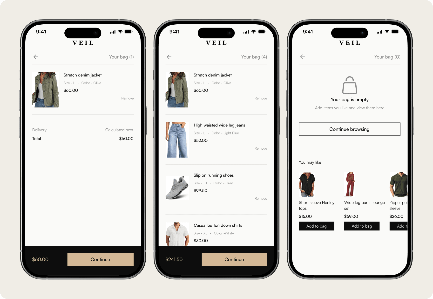
Cart review
Cart review
Cart review
Mobile
Mobile
Mobile
The order total is repeated in the sticky bar (Never ask users to think and pay at the same time). Delivery cost is deferred to the next step but signaled here to prevent surprise, reducing the chance of abandonment at the payment stage.
The order total is repeated in the sticky bar (Never ask users to think and pay at the same time). Delivery cost is deferred to the next step but signaled here to prevent surprise, reducing the chance of abandonment at the payment stage.
The order total is repeated in the sticky bar (Never ask users to think and pay at the same time). Delivery cost is deferred to the next step but signaled here to prevent surprise, reducing the chance of abandonment at the payment stage.
Desktop
Desktop
Desktop
Mobile hides the order summary in a sticky bar total. Web shows the full summary permanently in the sidebar. The desktop user can see his item, size, subtotal and total at all times without any interaction.
Mobile hides the order summary in a sticky bar total. Web shows the full summary permanently in the sidebar. The desktop user can see his item, size, subtotal and total at all times without any interaction.
Mobile hides the order summary in a sticky bar total. Web shows the full summary permanently in the sidebar. The desktop user can see his item, size, subtotal and total at all times without any interaction.

Account choice
Account choice
Account choice
Mobile
Mobile
Mobile
Guest-first always. This screen is the proof. Guest checkout is not an option, it is the default, the primary, the first thing mobile user sees.
Guest-first always. This screen is the proof. Guest checkout is not an option, it is the default, the primary, the first thing mobile user sees.
Guest-first always. This screen is the proof. Guest checkout is not an option, it is the default, the primary, the first thing mobile user sees.

Desktop
Desktop
Desktop
Three options presented as cards on desktop. Space allows this without creating hierarchy confusion. Mobile required strict vertical tiering because screen width forced it.
Three options presented as cards on desktop. Space allows this without creating hierarchy confusion. Mobile required strict vertical tiering because screen width forced it.
Three options presented as cards on desktop. Space allows this without creating hierarchy confusion. Mobile required strict vertical tiering because screen width forced it.

Delivery information
Delivery information
Delivery information
Mobile
Mobile
Mobile
Reduce input, not information. Six fields collapse into one with smart autocomplete. As the mobile user types her street name, the rest fills in automatically.
Address autocomplete replaces four manual fields, reducing effort and speeding up entry.
Reduce input, not information. Six fields collapse into one with smart autocomplete. As the mobile user types her street name, the rest fills in automatically.
Address autocomplete replaces four manual fields, reducing effort and speeding up entry.
Reduce input, not information. Six fields collapse into one with smart autocomplete. As the mobile user types her street name, the rest fills in automatically.
Address autocomplete replaces four manual fields, reducing effort and speeding up entry.

Desktop
Desktop
Desktop
Name fields adapt to context. On desktop, first and last name are split for clarity and easier scanning. On mobile, they merge into a single field to reduce typing friction.
Name fields adapt to context. On desktop, first and last name are split for clarity and easier scanning. On mobile, they merge into a single field to reduce typing friction.
Name fields adapt to context. On desktop, first and last name are split for clarity and easier scanning. On mobile, they merge into a single field to reduce typing friction.

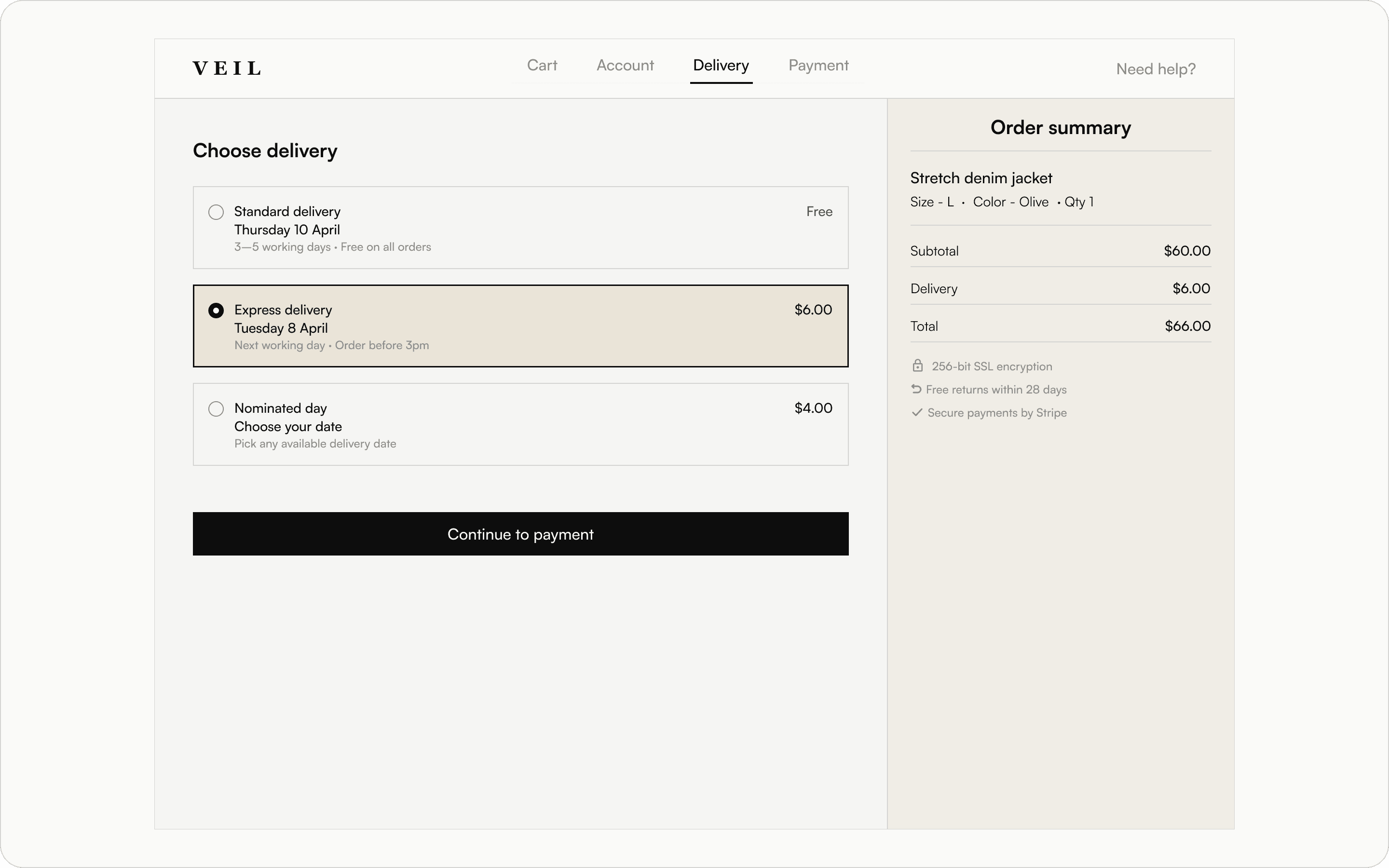
Delivery options
Delivery options
Delivery options
Mobile
Mobile
Mobile
Price transparency begins at delivery selection. As users choose a paid option, the sticky total updates instantly, ensuring no surprises at checkout.
Price transparency begins at delivery selection. As users choose a paid option, the sticky total updates instantly, ensuring no surprises at checkout.
Price transparency begins at delivery selection. As users choose a paid option, the sticky total updates instantly, ensuring no surprises at checkout.

Desktop
Desktop
Desktop
Consistency across devices. The same three options are maintained, while desktop uses wider cards to increase clarity through added detail, not added complexity.
Consistency across devices. The same three options are maintained, while desktop uses wider cards to increase clarity through added detail, not added complexity.
Consistency across devices. The same three options are maintained, while desktop uses wider cards to increase clarity through added detail, not added complexity.
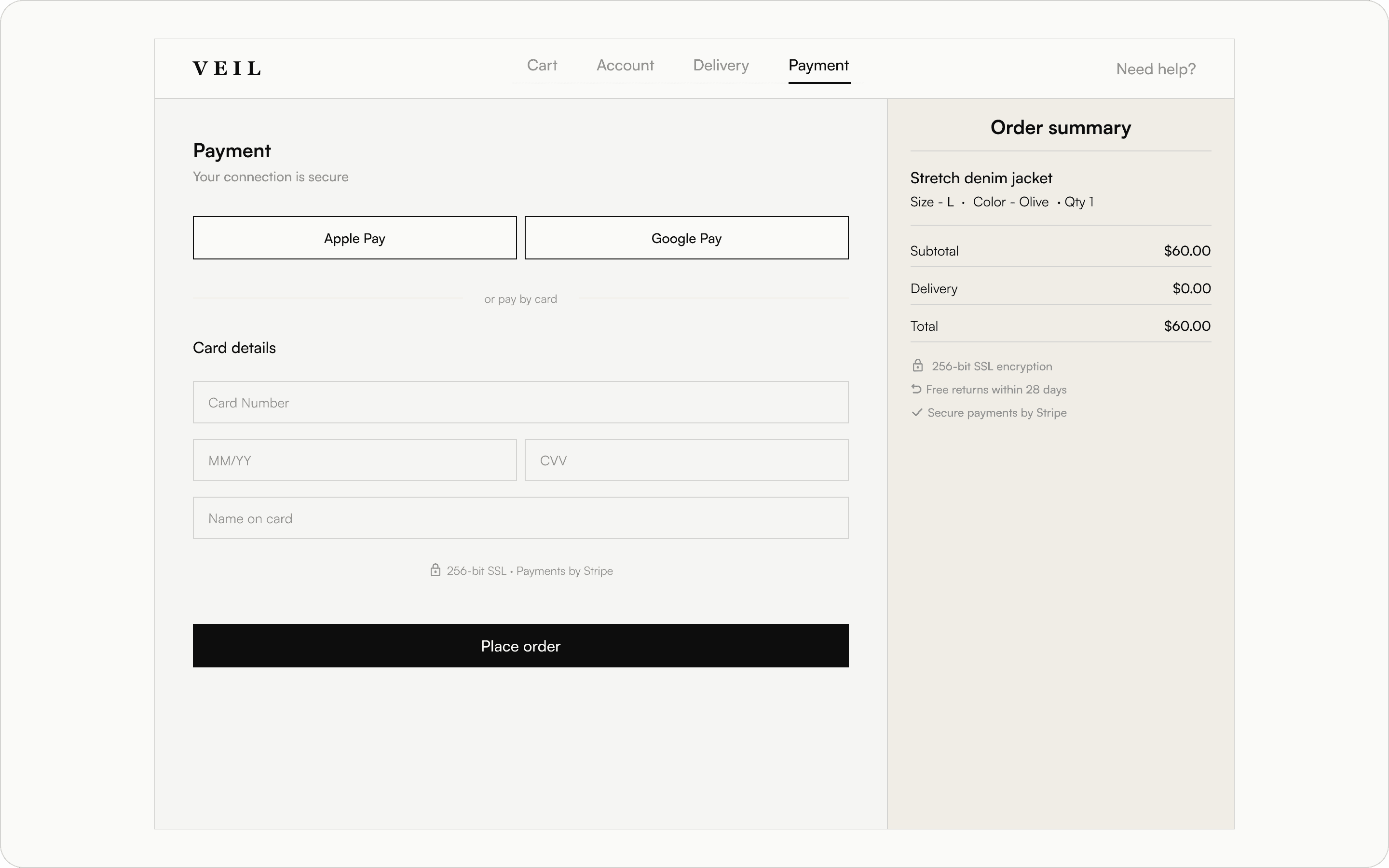
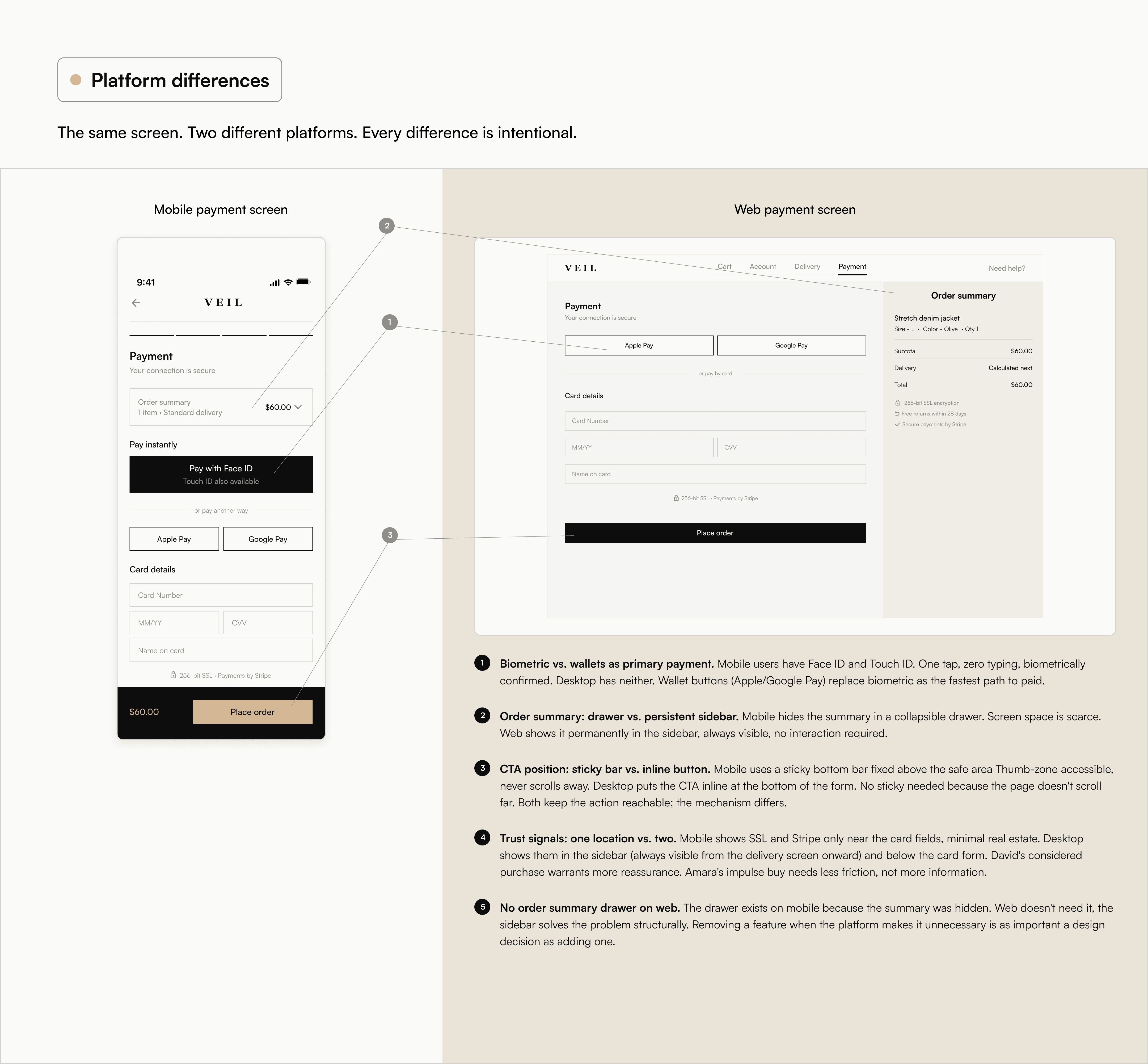
Payment
Payment
Payment
Mobile
Mobile
Mobile
A payment experience built for zero friction. Biometric payment leads as the fastest option, followed by pre-filled card details, with manual entry as a fallback. A clear hierarchy steers users toward minimal input, while adaptive fields reduce effort when typing is required. ‘Place order’ replaces ‘Continue’ to clearly signal the final step.
A payment experience built for zero friction. Biometric payment leads as the fastest option, followed by pre-filled card details, with manual entry as a fallback. A clear hierarchy steers users toward minimal input, while adaptive fields reduce effort when typing is required. ‘Place order’ replaces ‘Continue’ to clearly signal the final step.
A payment experience built for zero friction. Biometric payment leads as the fastest option, followed by pre-filled card details, with manual entry as a fallback. A clear hierarchy steers users toward minimal input, while adaptive fields reduce effort when typing is required. ‘Place order’ replaces ‘Continue’ to clearly signal the final step.

Desktop
Desktop
Desktop
Designed for desktop context. With no biometric option, wallet payments lead as the fastest choice, followed by a keyboard-friendly card form. The full order summary is always visible in a persistent sidebar, ensuring clarity without additional interactions.
Designed for desktop context. With no biometric option, wallet payments lead as the fastest choice, followed by a keyboard-friendly card form. The full order summary is always visible in a persistent sidebar, ensuring clarity without additional interactions.
Designed for desktop context. With no biometric option, wallet payments lead as the fastest choice, followed by a keyboard-friendly card form. The full order summary is always visible in a persistent sidebar, ensuring clarity without additional interactions.
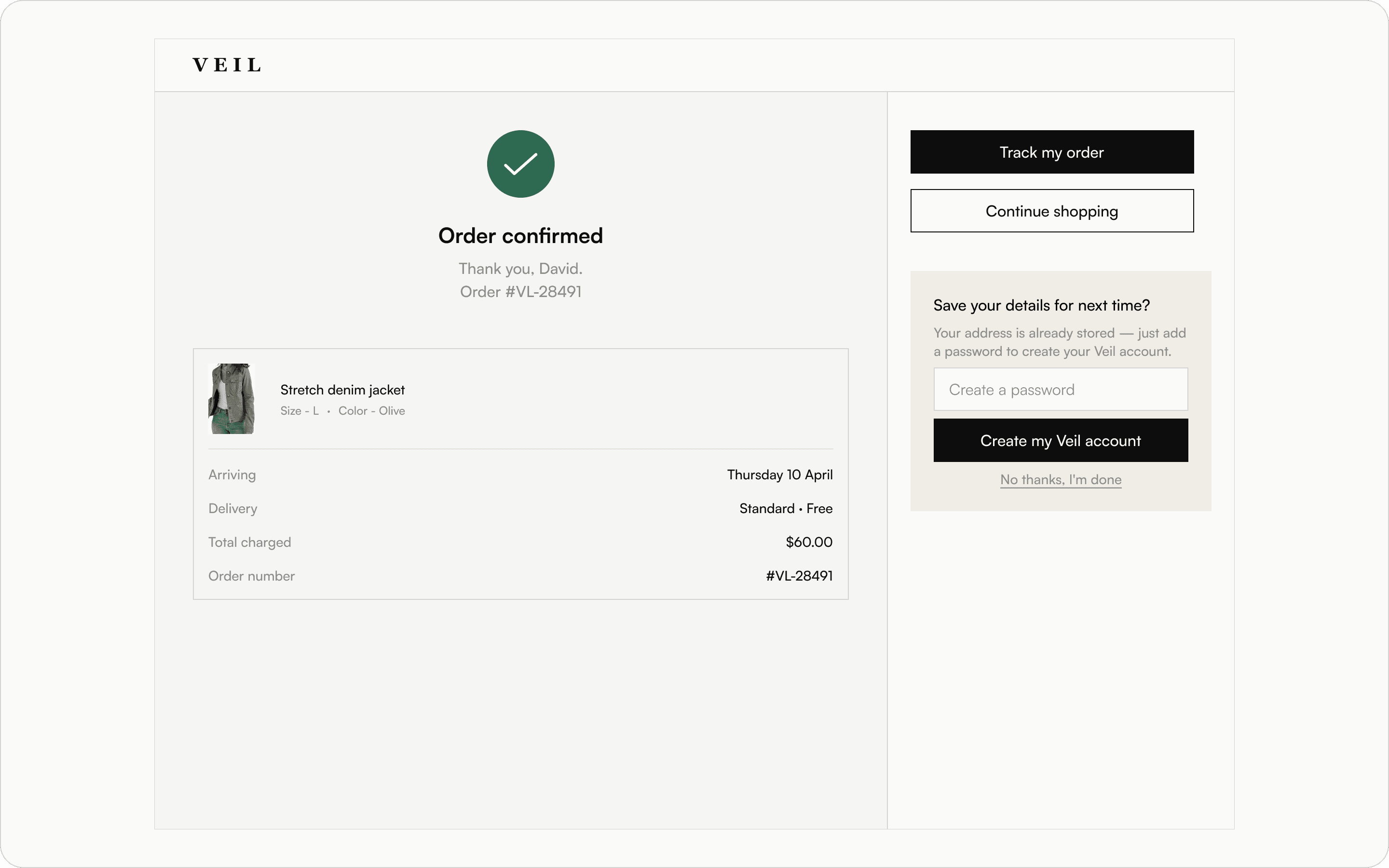
Order confirmation
Order confirmation
Order confirmation
Mobile
Mobile
Mobile
A single, focused confirmation state. For guest users, this is where the system delivers on its promise of post-purchase account creation. With key details already stored, sign-up is reduced to a single step. The prompt appears at the moment of highest trust, immediately after a successful purchase.
A single, focused confirmation state. For guest users, this is where the system delivers on its promise of post-purchase account creation. With key details already stored, sign-up is reduced to a single step. The prompt appears at the moment of highest trust, immediately after a successful purchase.
A single, focused confirmation state. For guest users, this is where the system delivers on its promise of post-purchase account creation. With key details already stored, sign-up is reduced to a single step. The prompt appears at the moment of highest trust, immediately after a successful purchase.

Desktop
Desktop
Desktop
With the process complete, the layout shifts. The two-column structure is redefined, using the left for confirmation details and the right for next steps and account creation.
With the process complete, the layout shifts. The two-column structure is redefined, using the left for confirmation details and the right for next steps and account creation.
With the process complete, the layout shifts. The two-column structure is redefined, using the left for confirmation details and the right for next steps and account creation.
Impact
Impact
Impact
35%
35%
35%
Potential conversion lift from checkout UX improvements
Potential conversion lift from checkout UX improvements
Potential conversion lift from checkout UX improvements
$350K
$350K
$350K
Additional revenue for a $1M/yr store at 35% conversion lift
Additional revenue for a $1M/yr store at 35% conversion lift
Additional revenue for a $1M/yr store at 35% conversion lift
Checkout abandonment isn’t a traffic problem. It’s a design problem.
Checkout abandonment isn’t a traffic problem. It’s a design problem.
Checkout abandonment isn’t a traffic problem. It’s a design problem.
Research from the Baymard Institute, based on over 41,000 checkout usability scores, shows that the average ecommerce site can increase conversion rates by up to 35% through checkout design improvements alone. No new features, no additional ad spend, no backend changes.
For a fashion brand like Veil generating $1,000,000 in annual revenue at a typical 2% conversion rate, that uplift translates to an additional $350,000 per year. Revenue recovered from users who already intended to buy.
This redesign directly targets the most common causes of abandonment across mobile and desktop: hidden guest checkout, lack of address autocomplete, incorrect mobile input types, unclear delivery timelines, and loss of order visibility at the payment stage.
Each decision is tied to a specific user behavior, a documented friction point, or a platform constraint. That is what makes the impact measurable.